
自分用メモなのでお許しください。
完成図
HTML
<div class="main">
  内容
 </div>
CSS
.main::before {
    content: "";
    width: 100%;
    height: 55px;
    background-color: #3d5a80;
    position: absolute;
    bottom: -1px;
    clip-path: polygon(0% 0%, 0% 100%, 50% 100%);
 }

.main::after {
    content: "";
    width: 100%;
    height: 55px;
    background-color: #3d5a80;
    position: absolute;
    bottom: -1px;
    clip-path: polygon(50% 100%, 100% 0%, 100% 100%);
}
画像を切り抜くのではなく、三角を疑似要素として追加する!
完成図
HTML
<div class="main">
  内容
 </div>
CSS
.main::before {
  position: relative;
 }

.main::after {
    position: absolute;
    display: block;
    content: "";
    width: 100%;
    height: 100px;
    background-color: #e7e7e7;
    clip-path: polygon(0 0, 302% 100%, 100% 100%, 0 100%);
    top: 87%;
    left: 0;
}
参考サイト
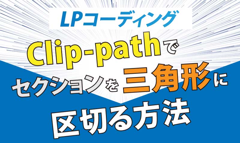
【LPコーディング】clip-pathでセクションを三角形に区切る方法 | Web制作者 × 歌うプログラマー石井よしまさ Official Web Site
ランディングページのデザインで、セクションの区切り方が、三角形になっている場合のコーディング方法の紹介です。今回はcssのclip-pathを使用して「上のセクションが単色背景、下のセクションが画像背景の場合」と「上のセクションが画像背景、...
ishii-singpg.com
→ あまり検索してもわからなかったのですが、このサイト様はめちゃくちゃわかりやすく記載されており、とても助かりました(´;ω;`)
CSSのクリップパスを使った応用例の紹介
mosyaはオンラインでHTML,CSS,JavaScriptを基本からしっかり学習できるサービスです。環境構築不要でその場でコーディング学習可能です。現役エンジニアが作ったカリキュラムに沿って学習を進めましょう。
mosya.dev
→ clip-path についての使い方を参考にしました!
