


グリットシステム
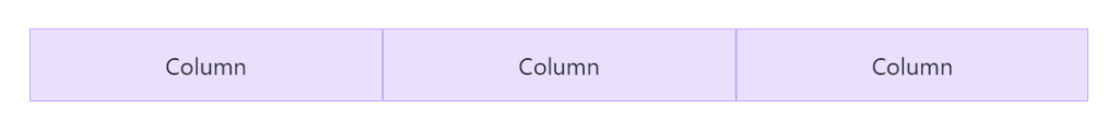
<div class="container text-center">
  <div class="row">
    <div class="col">
      Column
    </div>
    <div class="col">
      Column
    </div>
    <div class="col">
      Column
    </div>
  </div>
</div>
グリッドシステム
12columnシステム、6つのデフォルトのレスポンシブティア、Sass変数とmixins、および数十の事前定義されたclassesのおかげで、強力なモバイルファーストのflexboxグリッドを使用して、あらゆる形状とサイズのレイアウトを構...
getbootstrap.jp
位置
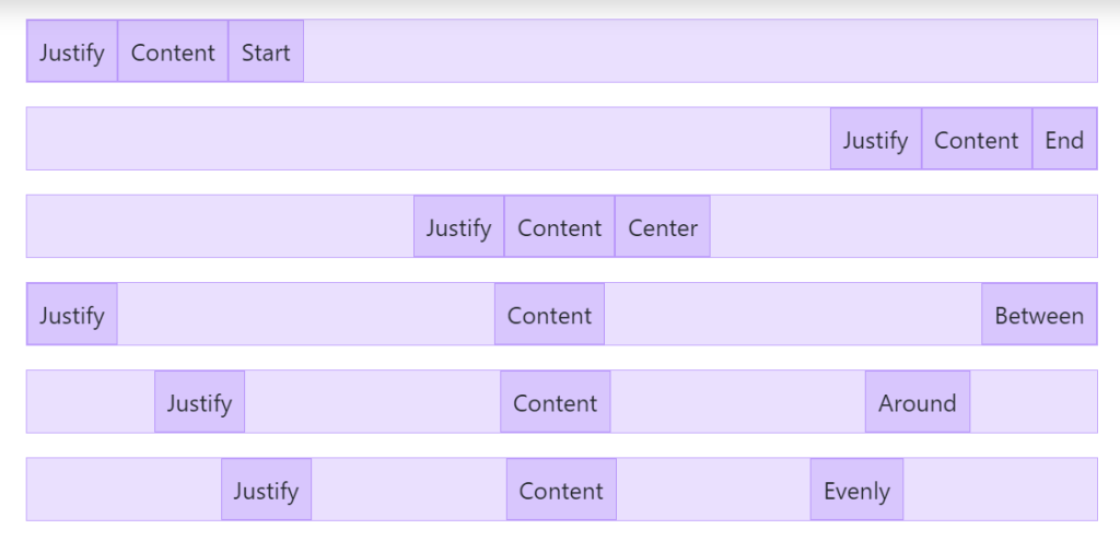
<div class="d-flex justify-content-start">...</div>
<div class="d-flex justify-content-end">...</div>
<div class="d-flex justify-content-center">...</div>
<div class="d-flex justify-content-between">...</div>
<div class="d-flex justify-content-around">...</div>
<div class="d-flex justify-content-evenly">...</div>
フレックス
レスポンシブ flexbox ユーティリティの完全なスイートを使用して、グリッドカラム、ナビゲーション、コンポーネントなどのレイアウト、配置、サイズをすばやく管理します。より複雑な実装には、カスタム CSS が必要になる場合があります。
getbootstrap.jp
余白(margin、padding、中央揃え)

<div class="mx-auto p-2" style="width: 200px;">
  Centered element
</div>
スペーシング
Bootstrapには、要素の外観を変更するための、幅広い短縮形のレスポンシブmargin、padding、gapユーティリティクラスが含まれています。
getbootstrap.jp
サイズ 幅、高さ
<div class="w-25 p-3">Width 25%</div>
<div class="w-50 p-3">Width 50%</div>
<div class="w-75 p-3">Width 75%</div>
<div class="w-100 p-3">Width 100%</div>
<div class="w-auto p-3">Width auto</div>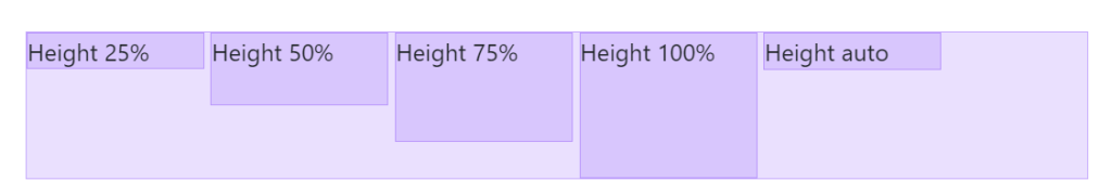
<div style="height: 100px;">
  <div class="h-25 d-inline-block" style="width: 120px;">Height 25%</div>
  <div class="h-50 d-inline-block" style="width: 120px;">Height 50%</div>
  <div class="h-75 d-inline-block" style="width: 120px;">Height 75%</div>
  <div class="h-100 d-inline-block" style="width: 120px;">Height 100%</div>
  <div class="h-auto d-inline-block" style="width: 120px;">Height auto</div>
</div>
サイジング
widthとheightユーティリティを使用して、要素を簡単に幅いっぱいまたは高さいっぱいにします。
getbootstrap.jp
文字のサイズや位置
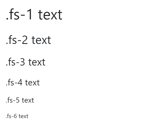
<p class="fs-1">.fs-1 text</p>
<p class="fs-2">.fs-2 text</p>
<p class="fs-3">.fs-3 text</p>
<p class="fs-4">.fs-4 text</p>
<p class="fs-5">.fs-5 text</p>
<p class="fs-6">.fs-6 text</p>
テキスト
テキストの配置、折り返し、太さなどを制御するための一般的なテキストユーティリティのドキュメントと例です。
getbootstrap.jp
カード
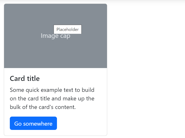
<div class="card" style="width: 18rem;">
  <img src="..." class="card-img-top" alt="...">
  <div class="card-body">
    <h5 class="card-title">Card title</h5>
    <p class="card-text">Some quick example text to build on the card title and make up the bulk of the card's content.</p>
    <a href="#" class="btn btn-primary">Go somewhere</a>
  </div>
</div>
カード
Bootstrapのcardsは、複数のバリアントとオプションを備えた柔軟で拡張可能なコンテンツコンテナを提供します。
getbootstrap.jp
ボタン

<button type="button" class="btn btn-primary">Primary</button>ボタン
フォーム、ダイアログなどでのアクション用に、複数のサイズ、状態などをサポートする Bootstrap のカスタムボタンスタイルを使用します。
getbootstrap.jp
アラート
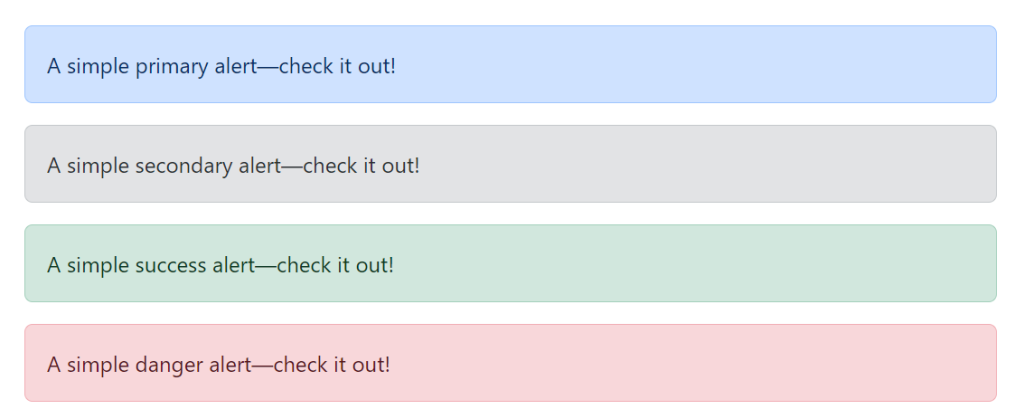
<div class="alert alert-primary" role="alert">
  A simple primary alert—check it out!
</div>
<div class="alert alert-secondary" role="alert">
  A simple secondary alert—check it out!
</div>
<div class="alert alert-success" role="alert">
  A simple success alert—check it out!
</div>
<div class="alert alert-danger" role="alert">
  A simple danger alert—check it out!
</div>
アラート
利用可能で柔軟なアラートメッセージを使用して、典型的なユーザーアクションのコンテキストフィードバックメッセージを提供します。
getbootstrap.jp
テーブル
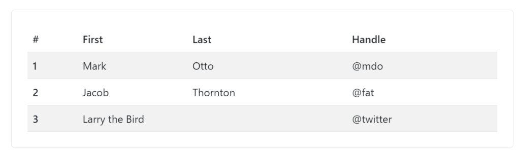
<table class="table table-striped">
  ...
</table>
テーブル
カレンダーや日付ピッカーなどのサードパーティウィジェット全体でのテーブル要素の広範な使用を考慮して、Bootstrapのテーブルのオプトインスタイリングに関するドキュメントと例です。
getbootstrap.jp
リスト 垂直・水平
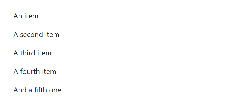
<ul class="list-group list-group-flush">
  <li class="list-group-item">An item</li>
  <li class="list-group-item">A second item</li>
  <li class="list-group-item">A third item</li>
  <li class="list-group-item">A fourth item</li>
  <li class="list-group-item">And a fifth one</li>
</ul>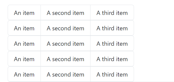
<ul class="list-group list-group-horizontal">
  <li class="list-group-item">An item</li>
  <li class="list-group-item">A second item</li>
  <li class="list-group-item">A third item</li>
</ul>
リストグループ
List group は、一連のコンテンツを表示するための柔軟で強力なコンポーネントです。内部のほぼすべてのコンテンツをサポートするように変更および拡張できます。
getbootstrap.jp
ボーダー
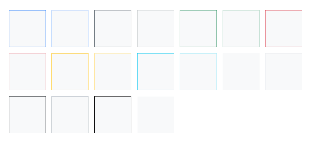
<span class="border border-primary"></span>
<span class="border border-primary-subtle"></span>
<span class="border border-secondary"></span>
<span class="border border-secondary-subtle"></span>
<span class="border border-success"></span>
<span class="border border-success-subtle"></span>
<span class="border border-danger"></span>
<span class="border border-danger-subtle"></span>
<span class="border border-warning"></span>
<span class="border border-warning-subtle"></span>
<span class="border border-info"></span>
<span class="border border-info-subtle"></span>
<span class="border border-light"></span>
<span class="border border-light-subtle"></span>
<span class="border border-dark"></span>
<span class="border border-dark-subtle"></span>
<span class="border border-black"></span>
<span class="border border-white"></span>
ボーダー
border ユーティリティを使用して、要素の border と border-radius を素早くスタイル設定します。画像、ボタン、その他の要素に最適です。
getbootstrap.jp
ナビ

<nav class="nav">
  <a class="nav-link active" aria-current="page" href="#">Active</a>
  <a class="nav-link" href="#">Link</a>
  <a class="nav-link" href="#">Link</a>
  <a class="nav-link disabled">Disabled</a>
</nav>
ナビとタブ
Bootstrapに含まれるナビゲーションコンポーネントの使用方法についてのドキュメントと例です。
getbootstrap.jp
アコーディオン(解説などで使用)
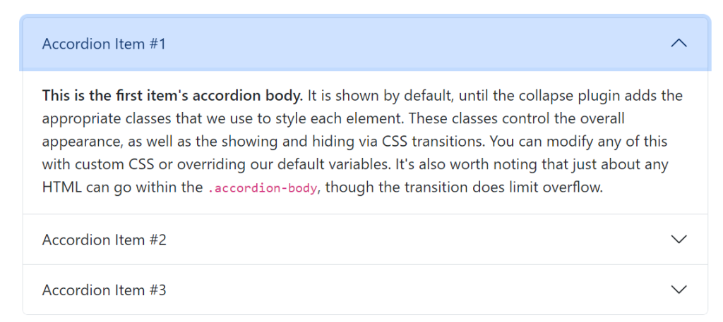
<div class="accordion" id="accordionExample">
  <div class="accordion-item">
    <h2 class="accordion-header">
      <button class="accordion-button" type="button" data-bs-toggle="collapse" data-bs-target="#collapseOne" aria-expanded="true" aria-controls="collapseOne">
        Accordion Item #1
      </button>
    </h2>
    <div id="collapseOne" class="accordion-collapse collapse show" data-bs-parent="#accordionExample">
      <div class="accordion-body">
        <strong>This is the first item's accordion body.</strong> It is shown by default, until the collapse plugin adds the appropriate classes that we use to style each element. These classes control the overall appearance, as well as the showing and hiding via CSS transitions. You can modify any of this with custom CSS or overriding our default variables. It's also worth noting that just about any HTML can go within the <code>.accordion-body</code>, though the transition does limit overflow.
      </div>
    </div>
  </div>
  <div class="accordion-item">
    <h2 class="accordion-header">
      <button class="accordion-button collapsed" type="button" data-bs-toggle="collapse" data-bs-target="#collapseTwo" aria-expanded="false" aria-controls="collapseTwo">
        Accordion Item #2
      </button>
    </h2>
    <div id="collapseTwo" class="accordion-collapse collapse" data-bs-parent="#accordionExample">
      <div class="accordion-body">
        <strong>This is the second item's accordion body.</strong> It is hidden by default, until the collapse plugin adds the appropriate classes that we use to style each element. These classes control the overall appearance, as well as the showing and hiding via CSS transitions. You can modify any of this with custom CSS or overriding our default variables. It's also worth noting that just about any HTML can go within the <code>.accordion-body</code>, though the transition does limit overflow.
      </div>
    </div>
  </div>
  <div class="accordion-item">
    <h2 class="accordion-header">
      <button class="accordion-button collapsed" type="button" data-bs-toggle="collapse" data-bs-target="#collapseThree" aria-expanded="false" aria-controls="collapseThree">
        Accordion Item #3
      </button>
    </h2>
    <div id="collapseThree" class="accordion-collapse collapse" data-bs-parent="#accordionExample">
      <div class="accordion-body">
        <strong>This is the third item's accordion body.</strong> It is hidden by default, until the collapse plugin adds the appropriate classes that we use to style each element. These classes control the overall appearance, as well as the showing and hiding via CSS transitions. You can modify any of this with custom CSS or overriding our default variables. It's also worth noting that just about any HTML can go within the <code>.accordion-body</code>, though the transition does limit overflow.
      </div>
    </div>
  </div>
</div>
maple
ここで大切なことが!!!
コピペして、行を増やしたいときに、このままではうまくいきません。
一つのボタンをクリックすると、ほかのものも開いてしまいます・・・
Q、Bootstrapのアコーディオン、一つ開くとすべて開いてしまいます。
A、コードを変えましょう!
<button class=”accordion-button collapsed” type=”button” data-bs-toggle=”collapse” data-bs-target=”#flush-collapseOne” aria-expanded=”false” aria-controls=”flush-collapseOne“> </button>
</h2>
<div id=”flush-collapseOne” class=”accordion-collapse collapse” data-bs-parent=”#accordionFlushExample”>
この3つを変える必要があります!

アコーディオン
Collapse JavaScript プラグインと組み合わせて、垂直方向に折りたたみ可能なアコーディオンを構築します。
getbootstrap.jp

